New year, new marketing goals for your small business. Last year, we rounded up super actionable landing page trends to help you start trying out some new design, copy, and conversion rate optimization tactics right away. And we’re doing it once again this year.
Here are landing page trends that we’re expecting to see this year that you can actually start using now.
Table of contents
- Exceptional product videos
- Integrated landing page copy and design
- Simple, streamlined design
- Monochromatic backgrounds
- Deep greens
- Playful buttons
- Micro animations
- Handwriting-like font and elements
- Bold, succinct copy
- “No risk” free trials
- How-to sections
11 landing page trends to watch for and try in 2023
Now, there are lots of landing page trends we’re expecting to see this year—AI generated design, immersive 3D animations, ChatGPT in action. But not every trend with the newest technology will work for your audience (or, let’s be honest, your budget). So here are the 11 landing page trends that are straightforward to implement so you can get started with right away.
1. Exceptional product videos
This list isn’t ranked, but this is the first clear trend for a reason: Your product videos should be a high-priority marketing asset. One that you use again and again. It’s no wonder we’re seeing these front-and-center on more and more landing pages.
Your product videos should already be sleek and enough to anchor these pages. The key to using them effectively is selecting the most relevant or appealing portions and splicing away. Goldcast, an event marketing software, does this really well.
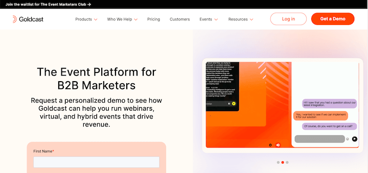
Image source | Click to watch the video
The videos featured here show off the product’s various capabilities in quick shorts, and the gallery setup lets users refer back if they want to.
Vimeo also does a great job of integrating the product video in the design of its page and using the asset to encourage a conversion more subtly.
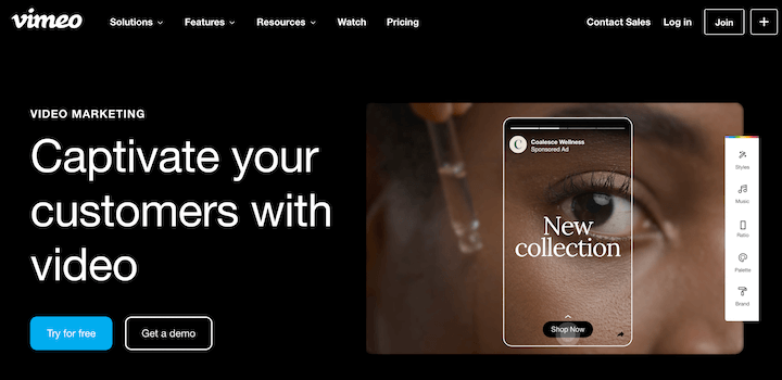
Image source | Click to watch video
This looks great, and it highlights Vimeo’s video editing capabilities without a clunky walkthrough of the product. Plus, the video is incredibly captivating, just like the copy promises.
And this brings me to the next landing page trend to implement now.
📗 Free guide:
2. Integrated landing page copy and design
Whether you’re a marketing team of one juggling designer and copywriter hats or working in a department with design and content groups, it’s easy for your visuals and your words (let’s hope they’re power words) to get started in silos. This year, you might want to change that.
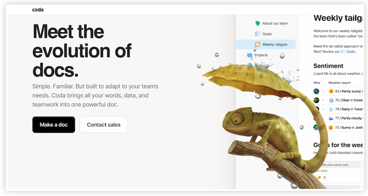
Check out this great example from Coda, a Notion-like tool for collaborative document and list creation. The realistic cartoon visual of the lizard with an umbrella tail contrasts nicely against the rest of the neutral, modern page—and the headline makes the punny copy/design.
And you’re not limited to static graphics. Check out the gif on Loomly’s landing page for social media tools.
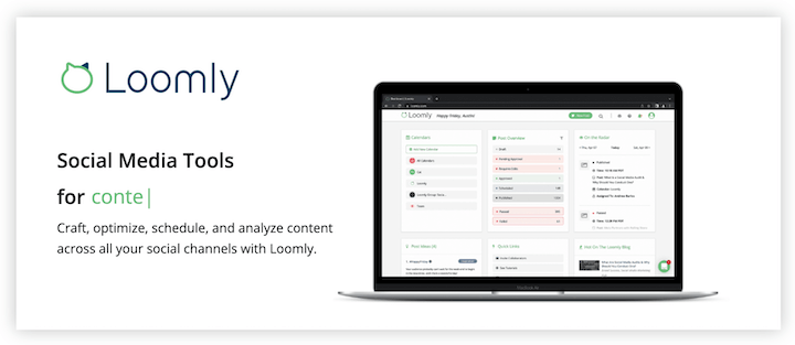
Image source | Watch the video
Simple, effective, and worth trying out with your audience.
3. Simple, streamlined design
Understated design for landing pages is a part of a larger branding trend that’s, well, counter-intuitive: anti-branding. Think monochromatic packaging, clean and unassuming color schemes, and minimal brand elements.
While the design style has been around for a while, it’s becoming more popular as Gen-Z buying power increases. Research suggests that this generation is, overall, skeptical of brands. 73% Gen-Zers only buy from brands that they believe in.
Here’s a great example from Typeform’s landing page for easy-to-create surveys. The background is beige (and, uh, blah), and the buttons and font are both a standard black.
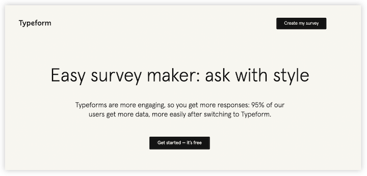
The effect? Straight-to-the-point page that makes the tool seem easy. Simple design is still design, after all, and anti-branding is still branding.
4. Monochromatic backgrounds
If anti-branding doesn’t match your brand personality—or, for that matter, your target audience—you can still keep it simple in 2023. Monochromatic website backgrounds are trending, and this style lends itself well to all of your landing pages. After all, you want your landing page skimmable and conversion-focused.
Take a look at Squarespace.
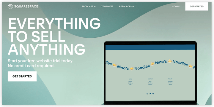
The natural curves in the design add depth, but the monochromatic palette keeps it, well, as background. And of course the go-to self-serve website builder takes the color scheme and extends it to the landing page in the landing page. You love to see that attention to detail.
5. Deep greens
Color psychology matters. Pantone’s color for the year is a deep pink Viva Magenta, and we’ll see this in a few examples today (don’t skip ahead just ahead, just pay attention to the buttons in the next trend). But the hues we’re seeing everywhere are on the other side of the color wheel. Greens.
Green has been trending in interior design for a few years now, and it’s always been a popular brand color for healthcare and wellness-related companies in particular. More recently, green has been everywhere—see the Squarespace background above, and the Ellevest example below.
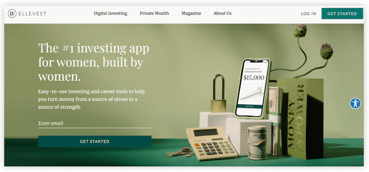
Notice that these greens are rich, whether they’re jewel-toned or earthy. When you’re giving your landing page a refresh, consider adding some deep green tones for an updated look for 2023.
6. Playful buttons
Trends in design or copy are great inspiration to experiment with, but at the end of the day the best landing page is a high-converting landing page.
But that doesn’t mean your buttons need to be perfunctory “submit” or, for that matter, big and orange. In fact, Unbounce found that getting specific in the call to action button can improve the conversion rate by up to 90%. Changing up your CTA is a great way to start playing around with your landing page buttons
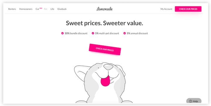
You can stick to creative copywriting, or you test out the design. Lemonade, a pet insurance company, does this so well. The landing page design features minimal black, white, and gray design with line-drawn cats and dogs in motion, plus the brand’s bright pink accents and buttons. And some of these elements interact on the page—including one of the little pets and the buttons.
7. Micro animations
Animation on your landing page is great for keeping your user’s attention and making the time on page memorable. (The pets from the Lemonade page? Adorable.) But animations can also help direct your user to interact with your page. Micro animations are UX design tools that guide a user to move further down the page or take an action. These are something you’ll want to try out in 2023.
This could be as simple as links changing color when the user hovers over them as a subtle encouragement to click, or as complex as something like this submit button.

Either way, I’d be surprised if these UX designs don’t nudge a few extra conversions for you this year.
8. Handwriting-like font and emphasis
It’s early, but we’re already seeing some themes in design trends for this year: playful visuals with personality, understated branding that appears barely there, and minimalist marketing. The common thread here isn’t new: It’s humanizing brands to create a more personal interaction between potential customers and marketing materials.
Another related landing page design trend to this? Handwriting-like fonts and elements.
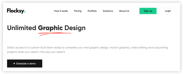
Here’s a great subtle example from Flocksy, a graphic design subscription company.
9. Bold, succinct copy
Minimalist marketing copy is all over the place, but most of us still need copy on our landing pages. So this year, choose your words selectively and make them count. Keep it short and make it bold.
MasterClass does this really well. (Not surprising, considering the oh-so-humble brand name.)
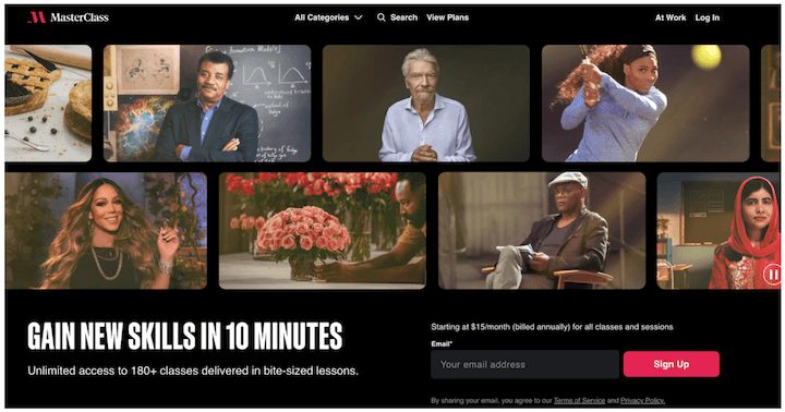
The headline is the value proposition: Learn from masters at their craft quickly.
There’s very little copy on the rest of the page, because that’s the big, bold draw.
📣 Free guide: The 36 Best Call to Action Phrases (Ever)
10. No risk free trials
We can admit it: Even as marketers who know the purpose of free trials and the importance of stakes to encourage a real product test and convert a customer, putting in your credit card information for a tool you want to try is annoying. It just is!
That’s why brands who can avoid it are doing so. We’ve seen a number of “no risk” or “no credit card required” disclaimers around email address forms for trails recently, and we think this is going to keep getting more popular. (Because it’s appealing, of course it is!)
11. How-to sections
While the goal of any landing page is going to be to convert visitors, the content is going to vary. It could be a free trial promo. An event or webinar registration. A product overview to book a demo.
All of these could benefit from a how-to section.
People like visuals and lists to break down larger topics. In fact, Semrush found that pages with lists every 500 words get 70% more traffic. While your landing page isn’t an article or a blog post, it is a page you’re looking to drive traffic towards. An increase in traffic that significant is worth a shot.
Take a look at this example from Lettuce Grow.

The pictures are eye-catching and display the product even if I’m not looking for an in-depth guide. The copy is super skimmable. And it makes the product look accessible and easy to use.
Breaking down your product or service in these crisp steps with compelling visuals and skimmable copy will help communicate to your landing page visitors what you’re offering and how well it works—even when they’re not necessarily looking for a step-by-step.
Test out these landing page trends in 2023
These are the landing page trends that will be worth your while. Straightforward to implement, cost-conscious, and effective for boosting conversions. Here’s to starting 2023 off right—with lots of creativity, and hopefully lots of conversions. We went through a lot here, so let’s recap the landing page trends:
- Exceptional product videos
- Integrated landing page copy and design
- Simple, streamlined design
- Monochromatic backgrounds
- Deep greens
- Bold, succinct copy
- Playful buttons
- Micro animations
- Handwriting-like font and elements
- “No risk” free trials
- How-to sections
And remember, while the trends are important, don’t jump on them at the cost of following the fundamental landing page best practices. Use our landing page guide to make sure you’re hitting those too!
The post 11 Super-Actionable Landing Page Trends to Jump On in 2023 appeared first on WordStream.
If you liked 11 Super-Actionable Landing Page Trends to Jump On in 2023 by Céillie Clark-Keane Then you'll love Miami SEO Expert